The brightest office isn’t necessarily the most uplifting. Choosing office paint colors to improve employee morale means considering how each space is used, how much daylight it receives, and how office lighting affects the finished shade. Color shapes the experience of a workspace, but it isn’t a guaranteed fix for focus or motivation.
A professional palette should feel welcoming without becoming cold, distracting, or impersonal. A shade that looks calm on a sample card may read differently under office lighting or beside computer screens. Employee preferences, existing finishes, and the demands of each work area matter, too.
This guide explains how to plan a balanced palette for focused work, collaboration, and shared spaces. You’ll learn how to account for lighting and surface finishes, test colors in the actual office, and gather employee input before a repaint. With a considered plan, interior painting can become one practical part of a wider workplace refresh in Dubai.
Key Takeaways
- Choose office paint colors to improve employee morale by considering the work, lighting, and people in each space, not by relying on color rules alone.
- Use color associations as starting points for discussion; shade, saturation, surrounding finishes, and room purpose all influence the overall impression.
- Compare calm neutrals, blue or green accents, warmer tones, and deeper hues to find a balanced palette for different office areas.
- Follow a practical selection process: identify workspace needs, gather representative employee input, test paint samples in place, and review them under actual lighting.
- Plan the repaint as part of a coordinated workplace refresh, bringing selected colors together with suitable preparation and consistent finishes.
Why Office Paint Colors Can Shape the Everyday Employee Experience
An office is experienced through more than its layout and equipment. Wall colors contribute to a room’s visual character, shaping whether it feels calm, lively, formal, or welcoming. That influence is real but limited: paint is one environmental factor among many, alongside lighting, noise, temperature, privacy, and layout. Choosing office paint colors to improve employee morale is a design decision, not a guaranteed way to change how people feel or work.
Color psychology examines how colors may relate to perception and emotion, but responses depend on context and individual experience. As the overview of color psychology explains, associations are not universal. A shade may feel energising to one person and intense to another. Its appearance also depends on its strength, the colors around it, and the room’s purpose. Treat common associations as prompts for discussion, not rules for employee behavior.
What employee morale means in a workplace
Morale describes the broader sense of motivation, confidence, and connection employees experience at work. It differs from an individual’s mood on a particular day. It’s also distinct from comfort, which concerns how easy a space is to occupy; focus, which relates to attention on a task; and productivity, which concerns work output. These experiences can influence one another, but they aren’t interchangeable.
Leadership, workload, recognition, and team relationships are central to workplace culture and morale. A fresh palette can contribute to a more considered environment, but it can’t correct unclear expectations, chronic pressure, or poor communication. Treat office design as support for a healthy workplace, not a substitute for effective management or meaningful action on employee concerns.
Where the office environment fits
Visual comfort and room character shape the everyday experience of being at work. A shared meeting room, for example, may benefit from a different atmosphere than a quiet area used for detailed tasks. No single palette suits every team: employees bring different preferences and experiences, and the same color can look different depending on its shade, surrounding finishes, and how the room is used.
Aim for a thoughtful fit between the space and its users, rather than promising that a particular hue will produce a predictable outcome. Gather employee perspectives, then weigh them against practical needs such as room function and the wider workplace design. A balanced office refresh can help create a more comfortable, coherent setting without overstating what paint can achieve.
Color can support a positive workplace experience, but it can’t guarantee one.
How Office Color Associations Work, and Why They Are Not Universal
Color associations can help a team discuss the atmosphere it wants in an office. They cannot reliably predict how every employee will feel. The phrase “calming blue” may describe a familiar impression, but it doesn’t mean a blue wall will make a team calmer, more focused, or more productive. Personal preferences, cultural experience, the task at hand, and the design around the color all influence perception.
For office paint colors to improve employee morale, the more useful question is not “Which color has the best effect?” but “What impression should this room create, and for whom?” This keeps planning grounded in the actual workplace and avoids treating paint as a direct intervention for morale or performance.
How common office colors may be perceived
Blue and green are often associated with calm or balance, so they may be useful starting points for spaces where a quieter atmosphere is desired. Yellow and orange can read as lively or warm, but broad areas in highly saturated shades may feel intense to some people. These are possibilities, not universal responses.
The strength of a color matters. A muted blue-grey and a saturated cobalt are both blue, yet they can create very different impressions. The same is true of soft, earthy green compared with vivid lime. Surrounding colors affect the balance, too: a bright accent among restrained neutrals may feel more controlled than that shade across every wall.
Why lighting and context change the result
Paint is seen through the light in a room. Daylight shifts in quality and direction during the day, while artificial lighting can make a shade appear warmer or cooler. Glazing, nearby buildings, window orientation, and the depth of a floor plate affect how much natural light reaches different work areas. In Dubai, offices in the same building can have different daylight conditions because their glazing and layouts differ.
Viewing direction matters, too. A wall facing a window may look different from one across the room, while shadows and nearby surfaces can alter how a sample reads. Assess a color where it will be used and under the lighting employees experience, rather than relying on a small swatch in another setting.
The same paint color can appear different under different lighting.
As you compare options, consider the combined effect of hue, intensity, surrounding finishes, and room purpose. A meeting space used for presentations may call for a different visual character than a quiet work area. Employee input can show whether a proposed shade feels comfortable or distracting, while practical design requirements help turn those preferences into a coherent palette.
A planned office interior painting project can bring selected colors into a consistent finish across the workspace. Treat painting as part of a wider refresh, with the goal of creating an environment that suits how employees use the office, not promising a particular emotional response.
Office Paint Colors Compared: Match the Palette to the Work
Start a useful palette with the function of each area, then account for the surfaces already in view. Rather than assigning a fixed emotional effect to each color, consider the overall visual balance: wall shade, furniture, flooring, screens, and lighting all contribute to a room’s character. The options below are starting points for planning office paint colors to improve employee morale, not guaranteed outcomes.
Palette direction: Calm neutrals
Suitable areas: Open-plan work areas, corridors, and rooms with varied furniture
Practical caution: A scheme built only from cool or pale neutrals may feel stark. Warmer undertones or restrained accents can add definition.
Palette direction: Blue or green accents
Suitable areas: Focus zones, quiet work areas, or shared rooms where a more settled visual character is preferred
Practical caution: Choose a shade that works with the existing floor and furnishings; strong contrast may draw attention away from the work area.
Palette direction: Warmer accents
Suitable areas: Meeting rooms, breakout spaces, or collaboration areas
Practical caution: Use warmer hues selectively. A saturated shade across every wall may dominate the room rather than simply distinguish the zone.
Palette direction: Restrained deep hues
Suitable areas: A feature wall, reception detail, or defined shared zone
Practical caution: Deep colors can make a space feel visually heavier, particularly if the room has limited daylight or already dark finishes.
Palette ideas for focus and quiet work
For individual work areas, begin with a restrained base that works alongside desks, flooring, and monitor-heavy layouts. Softer blue or green accents can introduce variation without turning every wall into a feature. Check contrast with adjacent surfaces, too. If a quieter visual setting is the goal, avoid abrupt shifts between very light and very dark finishes in the main field of view.
Consider the office as a complete visual system. A neutral wall behind dark desks and screens may read differently from the same color paired with pale flooring and light furniture. Choose colors that create a coherent backdrop rather than competing with equipment or existing finishes.
Palette ideas for collaboration and shared areas
Meeting rooms and shared spaces can carry more character. A warmer accent on one wall, or a deeper tone used to identify a collaboration zone, can create distinction while keeping the main palette balanced. Align the choice with the organization’s identity and the preferences of people who use the room, rather than making intensity the design objective.
A cohesive base color can connect workstations, meeting rooms, and circulation areas without making them identical. Repeat a neutral or undertone across zones, then vary accent placement according to each space’s purpose. This creates continuity while giving shared areas a clear visual identity. Review the combined palette in context before finalizing the repaint.
How to Choose and Test Office Paint Colors Before Committing
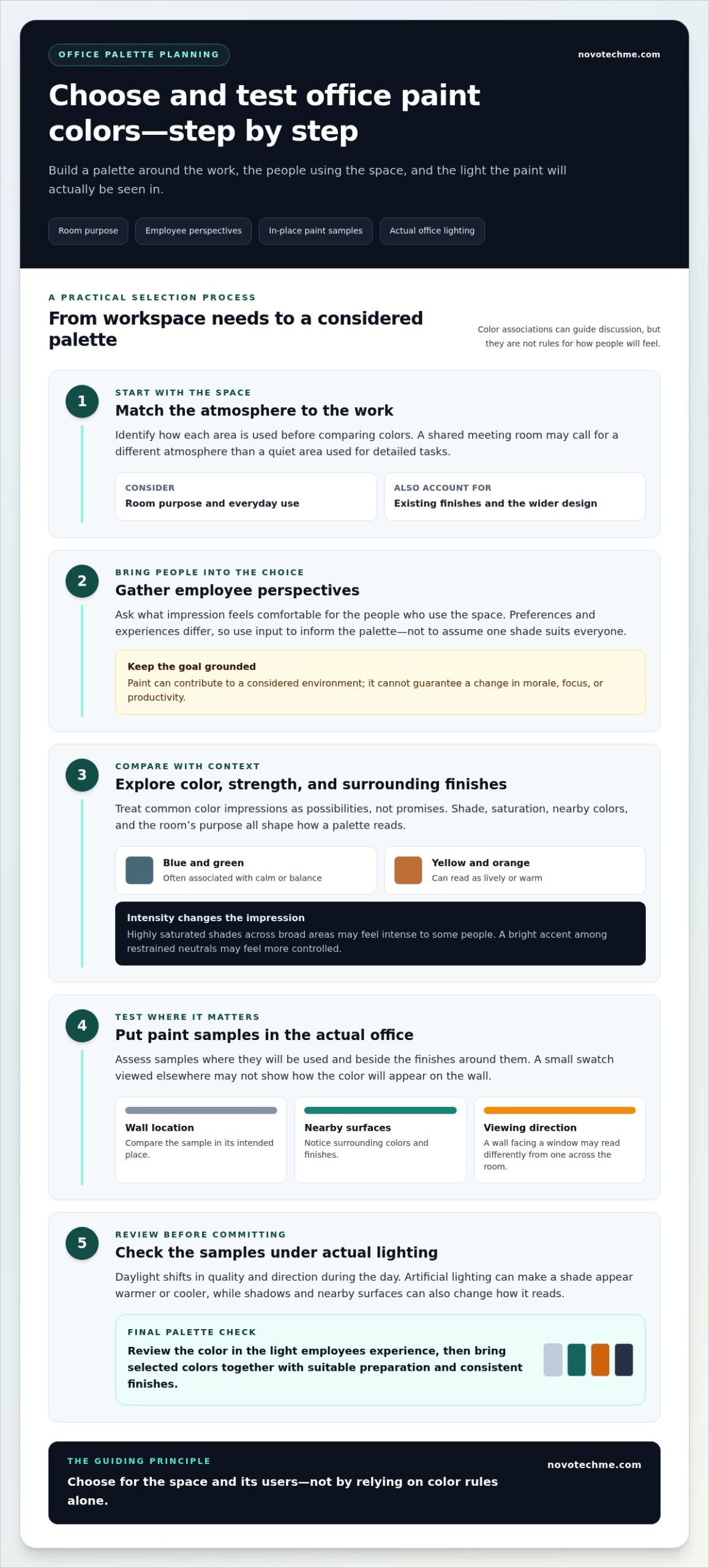
A structured selection process turns color preferences into a practical workplace decision. To choose office paint colors to improve employee morale, begin with the needs of each area, include employee perspectives, test shortlisted shades in place, then review the result as a complete scheme. This reduces the risk of choosing from a small sample that looks appealing alone but feels different across an entire room.
Start with activities, lighting, and employee input
Map the office by function before reviewing colors. Mark focus areas, meeting rooms, circulation routes, and shared spaces. Note how daylight and artificial lighting affect each area at the times employees use it. Broader workplace decisions can also connect to an office renovation guide, especially when paint is one part of a larger update.
Invite concise feedback from employees who represent different roles and use patterns. Ask what feels comfortable, what they prefer, and whether the current environment creates practical concerns. A vote can reveal strong preferences, but it shouldn’t be the only decision rule. Weigh feedback alongside room function, existing finishes, and the need for a palette that works across the office.
Test samples and assess the complete finish
Shortlist colors after identifying the room’s requirements. Place large samples on the intended walls rather than relying only on small printed swatches. View them at different times and under the lighting employees normally experience. Compare each option beside flooring, furniture, glazing, and fixed interior elements, since these can change how a shade reads.
Assess the finish as well as the color. Wall sheen affects how light reflects, which matters in areas with windows, screens, or frequent video calls. Surface condition and cleaning needs also inform finish selection. Judge a sample on the actual wall and in the surrounding space, not as a color chip alone.
Use these four steps to keep decisions clear:
- Identify needs: Match each area to its activities and practical requirements.
- Gather input: Seek representative employee perspectives, then weigh them against the design objectives.
- Test samples: View larger samples on intended walls alongside existing finishes and under usual lighting.
- Review the result: Check how the selected colors and finishes work together across connected zones before confirming the scheme.
Document preferred options and any concerns so the decision reflects both daily use and the overall workplace plan. A coordinated repaint can bring the chosen palette together through suitable surface preparation and consistent application. Plan your office repaint with NovoTech as part of a considered interior refresh.
Plan a Workplace Paint Refresh That Supports a Better Office Experience
A considered repaint brings together color, function, lighting, and employee input. No single shade can resolve workplace challenges or guarantee higher morale. Treat the palette as one part of a coordinated office refresh, with practical decisions about the areas to paint, the finishes required, and how work will be organized.
Coordinate color decisions with the painting scope
Before work begins, define the scope by office zone and surface. Identify which walls, ceilings, or other agreed surfaces are included, note differences in finish requirements, and establish a sequence that suits how the workplace operates. A meeting area may need a different finish from a circulation space, while adjacent zones may need consistent treatment to maintain a unified appearance.
Preparation matters to the final result. Addressing surface condition before application helps create a suitable base, while consistent application supports an even appearance across connected walls and rooms. Include these details in the plan early so teams can coordinate access, protect furniture and equipment, and organize work areas. Employees should know which spaces are affected and how to use the office during the work.
Build the work sequence around operational needs. Consider how employees can reach shared facilities if a corridor or meeting room is being painted, and coordinate the order of zones to limit unnecessary disruption. The right plan depends on the office layout and agreed scope; clarity in advance helps the refresh proceed in an orderly way.
Take the next step for a considered office refresh
Use the color plan as a practical brief: match each palette choice to the task and character of the space, evaluate it under the office’s lighting, and include representative employee feedback. Carry those decisions into surface preparation, finish selection, and a coordinated painting sequence. This keeps the repaint grounded in how the office is used rather than relying on color to deliver a promised morale outcome.
NovoTech provides painting and renovation services for workplace projects, including interior painting solutions and commercial painting. The company has operated since 1993 and serves Dubai and customers across the UAE. Explore NovoTech’s office renovation services as you plan the next stage of your workplace update.
Make Your Next Workplace Refresh More Intentional
Turn your preferred palette into a practical brief: identify the spaces to update, what employees need from them, and how the proposed colors fit the wider office. A thoughtful approach to office paint colors to improve employee morale begins with design choices that support the everyday experience, without expecting paint to solve broader workplace challenges.
Plan the repaint around the office’s surfaces, finishes, and operational requirements. Clear decisions made before work begins can help align the finished space with how your team uses it. NovoTech provides interior painting and renovation services for workplace projects in Dubai and across the UAE, helping organizations move from a considered color direction to a coordinated refresh.
Plan your Dubai office repaint with NovoTech and take the next step toward a workspace planned around your people and priorities.
Frequently Asked Questions
Which office paint colors are commonly associated with a calm workspace?
Soft blues, muted greens, and warm off-whites are commonly selected when a quieter visual feel is the goal. The specific shade and the room around it matter more than the color label alone. In a compact office with dark desks, for example, a subdued shade may feel less dominant than a vivid version of the same hue. Treat these colors as options to evaluate, not guaranteed mood setters.
Can office paint colors improve employee morale on their own?
No. Paint can contribute to how a workplace looks and feels, but it can’t address concerns such as excessive workload, unclear expectations, or strained team relationships. If staff feedback points to those issues, a repaint should sit alongside meaningful organizational action rather than substitute for it. Include workspace comfort in a broader conversation about employee experience, then set design priorities based on what the team actually needs.
Is blue the best office color for employee productivity?
No single color is best for every employee or task, and blue paint shouldn’t be treated as a productivity tool. A focused work area also depends on factors such as noise, screen placement, privacy, and task requirements. If blue is under consideration, compare a restrained shade with the office’s fixed finishes and assess whether it suits the intended setting. Choose based on fit, not a promise of improved output.
How should I choose paint colors for different office areas?
Start by noting what each area is used for and how it connects to adjacent spaces. For instance, a reception area may need a clear visual identity, while a corridor linking it to workstations can use a related base color for continuity. Consider where signage, furniture, and equipment sit before assigning an accent wall. This helps the palette distinguish zones without making the office feel fragmented.
Do office lighting conditions change how paint colors look?
Yes. Daylight and artificial lighting can shift how a wall color appears, and the effect may vary across a single office. In a Dubai workplace, glazing, blinds, and the depth of the floor layout can influence how daylight reaches a room. Compare samples under the lighting employees use during their regular workday, including with blinds adjusted and overhead lights on.
Are neutral colors a good choice for an office?
Yes. Neutrals can provide a flexible backdrop for company signage, furniture, and changing equipment. Their undertones still matter: a warm neutral may sit more comfortably with wood finishes, while a cooler one can create a sharper contrast. Before settling on a scheme, check how the neutral works with the organization’s existing visual identity so the finished office feels intentional rather than generic.
Should employees have a say in office paint colors?
Yes, employee input can reveal preferences and practical concerns that may not be obvious to decision-makers. Share a short list of realistic options and ask staff to comment on comfort, visual intensity, and how the colors fit the space. A simple vote can show broad preferences, but the final decision should also account for room use, consistency across zones, and the needs of employees who use each area.